Title-ating.
These days a title sequence can be a fully fledged highlight of a feature film but when cinema was starting out, the opening credits were a separate formality that read more like the pages of a telephone book than a legitimate art form. In the 1950s something changed, a revolution of words, shapes, movement, and colour began to transform into prologues that set the tone and even conveyed important story information. They’ve been evolving ever since and here we pay tribute to those graphical gurus that changed the game and set the trends in feature film title sequences.
Man with the Golden Arm (1955)
Designer – Saul Bass
Style – Classic Fantastic
The tale of heroin addicted card shark Frankie Machine (Frank Sinatra) challenged the taboo of the time and it’s opener was to be equally groundbreaking. The illustrated arm of addiction portrayed the subject in a palatably artistic light and Saul Bass’ solid minimalist graphics came to strengthen the resolve of many a classic. Arguably the most important title designer of all time (in that he virtually invented the things) his skills can be seen in many a Hitchocck and Scorsese creation with the timeless style continuing to inspire. In 2002 after a long lull in trend, Catch Me if you Can (2002) played pastiche to perfection reviving the popularity of the medium.
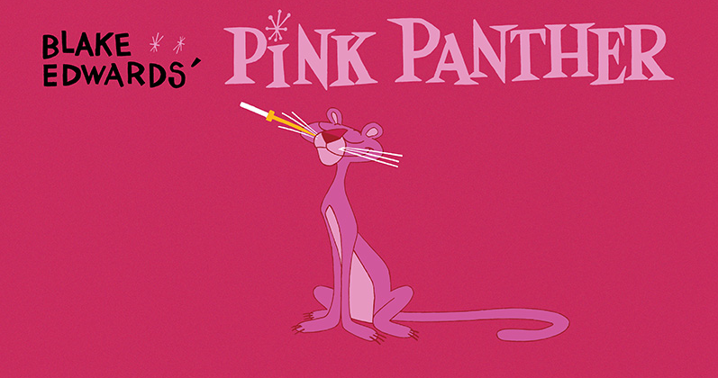
The Pink Panther (1963)
Designer – Friz Freleng & Hawley Pratt
Style – Traditionally Animated
Live action films with cartoon titles were not unheard of when this big cat came about however its mix of hand drawn slapstick, charming characterisation, and REALLY catchy theme music made it an icon. The focus was on comic value rather than informing and it had a notable impact on the television industry too – think Bewitched (1964) and I Dream of Genie (1965) kitschiness. Cartoon intros still pop up regularly but are increasingly rare in the form of traditional cel animation.
Superman (1978)
Designer – Richard Greenberg
Style – Super Sized
Long before the days of modern Marvel and DC digital blockbusters the original Superman created a benchmarck for larger than life typography. Wide open skies set the backdrop for gargantuan sized letterforms glowing with ether-like qualities to burst forth in a display of sheer might and power. These alphabetical giants were astonishingly clever for the time with designers having to go to painstaking lengths to achieve the perspective and effects. We’ve been inventing the technology to continue building them ever since.
Alien (1979)
Designer – Richard Greenberg
Style – Star Tracking
Perhaps it’s the vastness of the universe that calls for deep empty blacks and far set lettering because sci-fi film credits have been sharing these qualities for decades. For Alien, Greenberg took on board the sharp minimalist style that Kubrick had applied to the title card for 2001: Space Odyssey (1968) and developed it into something even more striking as a series of restrained linear shapes materialise to reveal the ominous wide-tracked brand mark. This spacious approach has carried on until present day with Gravity (2013) and Interstellar (2014) becoming some of the newest additions to the lineup.
The Shining (1980)
Sequence Designer – Greg MacGillivray & Garrett Brown
Style – Ghost Glider
Exploring the idea of isolation in the deep cold wilderness of Northern America, an all seeing eye soars overhead haunting the tiny traveling car of Jack Torrance (Jack Nicholson) suggesting he is doomed from the very start. Eerie music, simply sickly coloured text, and ghostly floating helishots instill an eerie discomfort that foreshadows the frights yet to come without adhering to any of the pre-existing horror tropes. The film and its titles revolutionised the way we look at the genre by producing a subtle spookiness that was fantastically homaged by the not so subtle Beetlejuice (1998).
Se7en (1995)
Designer – Kyle Cooper
Style – Industrial Grunge
Title sequences do not occur in a vacuum of popular culture and Kyle Cooper’s Se7en was a sign of the times when music was lo-fi, clothing was anti-fashion, and graphic design was on the same scrunched up page. A scratchy hand-scrawled font, seemingly random flickering overlays, and clipped excerpts of a Nine Inch Nails track formulated an industrial grungey edge that was still aesthetically appealing and technically well composed. Quickly snapped up by the genres of horror, thriller, and music videos galore, the style eventually filtered through to the remainder of mainstream media where it’s been part of our visual vernacular ever since.
Fight Club (1999)
Designer – Kevin Tod Haug & P. Scott Makela
Style – CGI Innerspace
Built entirely out of computer generated imagery, the backwards wormhole that was Jack’s rapidly firing internal cranial synapses made the most of animation capabilities of the late 90’s. Set to a bangin’ Dust Brothers soundtrack, Fight Club created a totally artificial macro environment that was consistently integrated throughout the film and wonderfully suited to the psychological narrative. The result was so popular it found appeal in some strangely unexpected places with a number of American crime dramas and their countless spin-offs being built on the very concept of forensic close-ups.
Kiss Kiss Bang Bang (2005)
Designer – Danny Yount
Style – Vector Silhouetta
When the smooth curvalicious shapes of vector art became popular in the early 2000’s, classically storyboarded sequences reminiscent of the 50s and 60s began to resurface with a modernised twist. In this instance Danny Yount created an atomic age inspired murder mystery that hailed the return of the classic title sequence. Though one of a number of good examples from the period including the ingenious Thank You For Smoking (2005), it’s highly illustrative elements composited into a multi dimension world of previously unseen proportions resulted in a skills race to create the next big intro. Media enthusiasts everywhere purchased Threadless tees and rejoiced.
Juno (2007)
Designer – Gareth Smith & Jenny Lee
Style – Homecrafting
By 2007, computer work had overtaken most traditional handcrafted forms of graphic design and a backlash was developing that trended towards more organic styles and handmade looks. Though not giving up on digital assistance entirely, Juno’s titles offered a humanistic touch through a sketchy style that employed the use of drawing, handcutting, Ellen Page on a treadmill, and an old school photocopier. The result was easily one of the strongest designs of recent times and it’s bespoke methodology spread like wildfire slotting comfortably into a growing culture of hipster folk sensibilities. Mixed media designs are now more common than ever and the trend shows no sign of slowing.
Enter the Void (2009)
Designer – Tom Kan
Style – Light Pollution
With advertising, technology, and visual media already seemingly at saturation point, it’s hard to imagine a mere title design that could so thoroughly overwhelm the senses and send viewers across the globe into fits of epilepsy (literally). Tom Kan’s speed referencing collection of electro Tokyo style flash credits are hyper aware of all that has come before and it could have been argued unlike any we would see again – until Kanye and Rihanna released All Of The Lights (2011) and the video was virtually verbatim. Love it or hate it, Enter The Void branched out in a brave display of abandon that challenges the known and continues to inspire evolution in the medium.
For more Lists, click here. If you’re digging ReelGood, sign up to our mailing list for exclusive content, early reviews and chances to win big!